Help Free the Web with WaSP
We've stung, we've swarmed, we've buzzed. Sometimes we've failed to make our mark, other times we've been far more successful. But there's one thing that's certain, and that is as of Monday, March 13th, the Web Standards Project enters a new time in its history, opening the hive up to better include the communities and issues we've done our black and gold best to represent since 1998.
WTF?
WaSP Task Forces, of course.
The first activity of WaSP's open model is the WTF: Getting the Job Done Right panel at SXSW. This panel will review the activities of the Task Forces within WaSP. We'll have the following Task Force representatives explaining their failures, successes and hopes for the future:
- Kimberly Blessing (WaSP): Education Task Force (EduTF)
- Molly E. Holzschlag (WaSP): Moderator, Acid2 TF
- Matt May (WaSP): Accessibility Task Force (ATF)
- Drew McLellan (WaSP): WaSP Strategy
- Dori Smith (WaSP): DOM Scripting Task Force
- Jennifer Taylor (Adobe): Dreamweaver Task Force
- Chris Wilson (Microsoft): WaSP / Microsoft Task Force
WaSP Annual Open Meeting 1.0
While we've held our annual meetings at the SXSW event for several years, this year we're holding the meeting in public, opening up the forum for anyone present to participate. The meeting will begin with opening remarks from WaSP co-founder Jeffrey Zeldman and commentary from Steve Champeon who guided WaSP through the early part of 2000. We will then introduce the current WaSP and WaSP Task Force members in attendance, as well as formally welcoming new WaSPs.
Then, things will get especially interesting as the meeting turns to your concerns. There will be four hot topics that we've gathered up from public feedback about WaSP activities presented for open commentary and public input. While the discussion will be moderated for the sake of time concerns, the discussion will focus on how we can better serve the public good, and how you as the public can participate in WaSP activities in inclusive and proactive ways.
Virtual Ribbon Cutting
While many WaSPs as well as WaSP supporters and critics will be present at this year's SXSW, many cannot attend. What's more, we want to make sure our open model extends into the future. To that end, we shall be cutting the virtual ribbon on the new WaSP Web site, which will have a fresh design and, something that's been long overdue in coming, open comments so that this new, inclusive vision continues forward.
If you are attending SXSW, we hope you will join us for both the informative WTF panel and the open meeting. If you cannot attend, there will be live blogging of the event and while it is as of yet uncomfirmed, we hope to podcast the meeting. And of course, stop by to see the new site and add your voice. Together, there is no doubt in my mind that we can free the Web by promoting its core vision: Interoperability, accessibility and community.
[This will be the last necessary cross-post for your comments and trackbacks, I'm happy to say!]
Microsoft IE7 Progress: Sneak Preview of MIX06 Release
I'm sitting here with Malarkey and Markus Mielke in Mandelieu, a beautiful town in the south of France. We're here attending the W3C Technical Plenary and Markus has been kind enough to give us a sneak preview of the IE7 release that's expected for the MIX06 event.
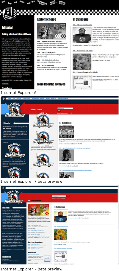
We've been looking at a number of sites in the newest beta build, and we're seeing some truly impressive work. Two designs have been particularly compelling as use cases. Malarkey's personal Web site, which has an IE6 specific version and a version best viewed in more modern browsers; and Gemination, Egor Kloos's progressively enhanced CSS Zen Garden design that sends two completely different designs to IE6 and modern browsers out of the same CSS file.
Here's the progress of Malarkey's site, from IE6 to IE7 Beta Preview, to IE7 MIX06 Release:

And Gemination, IE6 to IE7 Beta Preview to IE7 MIX06 Release (this is cut off to the right a bit to fit the image, but suffice it to say everything works, even the hover effects!):

Markus tells me that several more fixes are going to make it into the MIX06 release, too.
On behalf of WaSP and the WaSP / Microsoft Task Force it makes me very proud to be here today watching history unfold.
[This entry cross-posted to take your comments, Malarkey's got a post about it and is accepting comments as well.]
Kudos to Michigan State
Michigan State University launched a redesign of its Web site, yesterday.
Designed and developed with best practices that follow Web Standards and Web Accessibiity, the university Web site looks good and validates to the XHTML strict doctype.
The redesign involved the teamwork of the MSU Libraries, Computing, and Technology and MSU University Relations.
Congratulations to everyone involved with the redesign!
Visit Michigan State University's About the Site and Accessibility sections for more information.
Visit our WaSP Education Task Force section for information, resources, and interviews of others who have worked on redesigns or advocated change at their schools.
Migration
Steve here, with a brief post asking for your forbearance during the next few hours, as I migrate the Buzz from Movable Type to Wordpress, in preparation for some exciting new stuff coming soon from the WaSP.
NFB vs. Target in perspective
Since the National Federation of the Blind sued Target Corp. for the inaccessibility of its Web site, many people have taken sides, vilifying Target and/or lionizing NFB in turn. I think it's too early for that, if it's necessary at all. In terms of US law, this was a suit that needed to happen, because the case law on Web accessibility is so far pretty thin. The most important thing to take away from this news is that the same case could be brought against dozens of comparable e-commerce sites, and all over problems that stop many users dead in their tracks, and yet could be fixed without affecting their visual design or functionality.
I'm hesitant to paint Target as the solitary enemy of users with disabilities. Let's be clear: The accessibility of Target's site is terrible. But in a short review I did of big-box store sites this morning, they're not the worst around. In fact, they're pretty much the middle of the range.
Take Costco.com. Please. From an accessibility standpoint, if Target is bad, Costco is a godless abomination. Never mind the distinct lack of alt text (which, by the way, is not the alpha and omega of Web accessibility): Costco's homepage contains over a hundred subcategories in hidden drop-down boxes. But they're not links. Noooooo. They're table cells, with mouse events that fire JavaScript functions to load the relevant pages. Nice. The Costco site is not only inaccessible, its code is so poorly designed that its bloated size alone contributes to major usability problems for everyone.
Costco is only one example of many I found. But I'm picking on them in particular because their brick-and-mortar operation is refreshingly progressive. The company prides itself on a "workplace focused on ethics and obeying the law", and has enormous signs at their front door stating that they strive to accommodate the needs of their customers in accordance with the Americans with Disabilities Act.
So, to what do we attribute the utter inaccessibility of many e-commerce sites: ignorance, miscommunication, or malice? I've seen all three in practice. Often, it doesn't take the threat of a lawsuit to get site owners to come around; they merely need to understand the problems, and what they can do to solve them, in order of impact on the user.
But I've also seen cases where it's a legal game of chicken: some companies refuse to comply with a legal mandate that they feel doesn't clearly apply to them. They're gambling that the cost of being found guilty of non-compliance is lower than that of conforming to a standard that may not apply to them. This strategy falls apart like a house of cards as soon as one of them is found liable. And it's a tactic I find particularly odious when they're consciously acting to keep users with disabilities out.
The fact is that the Web has afforded many people with disabilities new-found potential to buy and sell things, work, manage finances, find community, gather news, and access government services -- all things able-bodied people take for granted. When people with disabilities received legal protection, it wasn't given out of pity. It was given to protect their right to participate equally in society. Web designers and developers can enable that equal participation with every site they design, using modern coding principles. Or they can hide in a castle or a cave, clutching their legacy code, certain that those evil, litigious disabled people are out to get them.
So, which is it?
[This entry cross-posted to take your comments and trackbacks.]
Yahoo! Developers: Setting a Standard for the New Professionalism
In an article published Monday, February 13, 2006, Yahoo! Senior Web Developer Nate Koechley outlines the Yahoo! concept of Graded Browser Support.
The approach is a work of art so beautiful and sensible it literally made me weep for joy. In light of ongoing discussion regarding a new professionalism for Web designers and developers, it's clear that the approach that Koechley outlines is not only logical and simple, but also profoundly practical.
One of the most powerful aspects of the document is it approaches the entire challenge of browser support for sites from an enlightened point of view. Instead of calling out any given browser as problematic and focusing on how to manage it, Koechley points to the nature of the Web and its evolution, encouraging us to work within that context:
“Expecting two users using different browser software to have an identical experience fails to embrace or acknowledge the heterogeneous essence of the Web. In fact, requiring the same experience for all users creates a barrier to participation. Availability and accessibility of content should be our key priority.”
The report goes on to describe Yahoo!'s definition of browser support, how it approaches “grading” browsers, and outlining a very practical means of addressing quality assurance. Along with the article is a grid that shows grades of support common browsers receive.
That all Web designers and developers seeking to solve difficult browser support concerns should read this article should go without saying.
Putting similar policies and processes in place for any design and development environment, large or small, would be a monumental step forward for not only the cause of Web standards, but improving the quality of the Web itself.
[This entry cross-posted to take your comments and trackbacks].
Staying on Target
A lot can happen in 24 hours.
In the time since yesterday's post, Taking Aim at Target(.com), the Target.com web site has been changed to address at least the image based submit buttons on the Target Pharmacy sign in page. It no longer requires a mouse click to submit the forms.
They literally fixed this overnight. If it took so little time to fix, why now and not ten months ago when the US National Federation of the Blind originally complained to Target?
We have all heard it: "until there's the threat of legal action, companies just won't take notice." It shouldn't take a law suit and significant press and buzz across the web to motivate people into action. If we rely on law suits from special interest groups and then fix those problems, we don't do anything for any of the other groups that require accessibility.
So, a small victory, and kudos to Target for making this change. Too bad the alt attributes for the submit buttons on the sign in page are still missing.
Clearly this is a long way from over and we're all watching with interest.


